What can a pixel light screen actually display?
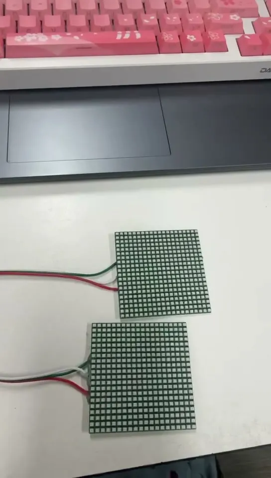
The listing shows a photograph on the panel. In the room, a 20 × 30 screen has 600 pixels, and a single phone icon has more than five times that. What a light screen can show is fixed by two numbers that are rarely on the box: how many LEDs it has, and how far apart they sit.
Key takeaways
- Count the grid: a 20 × 30 curtain is 600 pixels, fewer than one 60 × 60 phone icon. Fine detail does not survive.
- Minimum viewing distance in metres ≈ pixel pitch in millimetres. At a 30 mm pitch an image only resolves from about 30 m.
- Indoors, design for visible pixels: falling effects, gradients, one big shape, one or two characters at a time.
- Latin text needs 5 pixel rows to be legible, 7 to be comfortable; CJK needs 12 × 12. Columns ÷ 5 = characters at once.
- Test the layout with a big letter F before mounting. A screen that goes reddish on bright frames has an undersized supply.
The two numbers that decide everything
A light screen is a grid, and you need:
- Its resolution — how many LEDs across, how many down. Count them if the specification does not say. This is your entire canvas.
- Its pitch — the physical distance between neighbouring LEDs, usually somewhere between 3 cm and 15 cm on a curtain-style screen. Commercial mesh curtains for building facades run from 30 mm to 100 mm for the same reason: they are meant to be seen from across a street.
A typical decorative light screen might be 20 LEDs across and 30 down. That is 600 pixels in total. A single small app icon on your phone is around 60 × 60 — over five times as many pixels as the entire screen. Hold that number and most questions about light screens answer themselves.
The product photography problem. Light screens are routinely marketed with images of sharp logos and photographs. Those renderings are what an extremely high-resolution screen would show. A decorative pixel curtain shows a heavily simplified version — recognisable shapes and a few large characters, not detail. That is not a defect in any particular product; it is what 600 pixels can do. Judge a screen by its pixel count and pitch, not by the listing render.
How far away does it need to be?
This is the question that separates a screen that looks impressive from one that looks like a bag of loose bulbs, and it is pure geometry. Any pixel display resolves into a continuous image only once you are far enough away that your eye stops separating individual points. The long-standing rule of thumb in the LED display trade is that the minimum comfortable viewing distance in metres is roughly equal to the pixel pitch in millimetres.
Minimum viewing distance (m) ≈ pixel pitch (mm)
| Pitch | Image resolves from about | Realistic use |
|---|---|---|
| 30 mm (3 cm) | 30 m | Building facades, large shopfronts |
| 50 mm (5 cm) | 50 m | Outdoor walls seen from across a street or car park |
| 100 mm (10 cm) | 100 m | Large outdoor displays only |
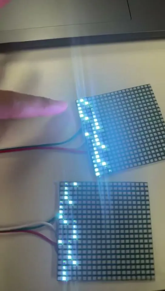
The conclusion is uncomfortable: at any indoor distance, a curtain-pitch screen will never look like a picture. You will see the individual LEDs. That is fine — you design for it.
What works indoors, at three to five metres
Indoors, treat the screen as a light effect that happens to be organised in a grid, not as a display.
| Content | At 3–5 m indoors |
|---|---|
| Falling and rising effects — rain, snow, embers, sparkles | Works; the pixels read as particles |
| Colour gradients and waves crossing the whole panel | Works |
| One large shape — a heart, a star, a tree, a plain arrow | Works if the strokes are several pixels thick |
| Very large text, one or two characters at a time | Works |
| Photographs, logos with fine detail | Does not resolve |
| Multi-word text, thin lines | Does not resolve |
How much text fits on the grid?
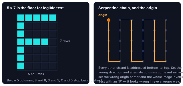
Text on a low-resolution grid follows a hard rule that has nothing to do with the product and everything to do with typography. A Latin character needs a minimum of 5 pixel rows to be legible at all, and 7 rows to be comfortable. Below 5, letters become ambiguous — B and 8, S and 5, O and 0 stop being distinguishable.
So on a screen 30 LEDs tall you can fit four comfortable lines of text at 7 rows each, if you allow nothing for spacing. Allow a row between lines and you get three. Each character needs roughly 4–5 columns of width plus a gap, so on a 20-LED-wide screen you can show about four characters at once.
Rows ÷ 8 = lines of legible text. Columns ÷ 5 = characters visible at once.
| Grid (across × down) | Latin characters at once | Lines of text | CJK characters at once |
|---|---|---|---|
| 20 × 30 | 4 | 3 | 1 |
| 32 × 32 | 6 | 4 | 2 |
| 40 × 30 | 8 | 3 | 3 |
| 64 × 32 | 12 | 4 | 5 |
Four characters is why almost all light screen text scrolls. It is not a stylistic choice — the message does not fit. Scrolling has its own cost: the shorter the visible window, the harder the message is to read, because the reader has to hold earlier characters in memory. Our practical limit is about twelve characters per message on a curtain-pitch screen. "MERRY XMAS" works. A shop's full opening hours do not.
Chinese, Japanese and Korean characters need more. CJK glyphs need at least 12 × 12 pixels to stay distinguishable, and 16 × 16 to be comfortable. On a 20-wide screen that is one character at a time. Plan for single-character sequencing rather than scrolling, which is much more readable at that size.
What content looks like on one
These are previews from our own app, at the aspect ratio of a wide panel assembly. They make the resolution argument better than any description: a shape built from whole pixels reads cleanly, and anything relying on fine detail does not survive the trip.



App effect previews, not photographs. On real panels the pixels bloom slightly and blend at a distance — which is why viewing distance matters as much as pixel count. A plain curtain light cannot show any of this; which curtain variants are screen-capable is in curtain light sizing and variants.
Getting the pattern to land where you intended
The controller does not know the shape of the screen you built. It has a chain of LEDs and whatever layout you have told it about. If the layout in the app does not match the physical panel, patterns come out mirrored, sheared or split — which looks like a broken screen and is not. Three things have to agree:
- Grid dimensions. The width and height set in the app must match the LEDs you actually have. Count them once, physically, and write it down. Counting from the product listing is how people end up one row out, which shears the whole image.
- Chain direction. The LED chain runs up one strand and down the next in a back-and-forth serpentine, or it runs the same direction on every strand. These two wiring styles need different settings, and the wrong one flips every other column. The symptom is unmistakable: vertical stripes of the image appear reversed.
- Origin corner. Which corner the chain starts at determines whether the image is upright or upside down. If your whole picture is inverted, this is the setting, not the way you hung the panel.
Test all three with a single asymmetric image before you commit to a design — a large letter "F" is the traditional choice, because it looks wrong in every possible way it can be wrong. A symmetrical test pattern passes even when the configuration is mirrored, which is how people end up discovering the problem after the whole wall is up.
Multiple panels as one screen
If you are joining panels to make a bigger canvas, the joins are where the effort goes.
- Keep the pitch continuous across the join. The gap between the last column of one panel and the first column of the next should equal the pitch within a panel. Panels butted with a wider gap show a visible seam that no software fixes, because the missing column of pixels genuinely is not there.
- Chain order is physical order. Panels are addressed in the order they are connected. Hang them in the order you chained them or every effect crossing the join will jump.
- Keep every panel the same way up. A single inverted panel inverts its part of every image.
- Set the combined dimensions, not the panel dimensions. Two 20-wide panels side by side are one 40-wide screen. Leave it configured as 20 and you get the same image twice.
Data chains from panel to panel; power does not. Feeding every panel separately, and reading a scrambled multi-panel image, are covered in chaining light screen panels.
Why a bright frame turns the screen red
A screen running white across the whole grid draws far more than the same screen running a dark animation with a few lit pixels. Peak draw, all pixels white, is the number the supply has to cover — and the demo effects that ship on these products are usually sparse, so the screen appears to work on an undersized supply right up until someone selects a white background.
The symptom is characteristic: the screen dims and the colours drift toward red as soon as a bright frame appears. The voltage sags, and blue and green LEDs have a higher forward voltage than red, so they fade first. If your screen goes reddish on bright content, the problem is the power supply, not the colour settings.
Take the full-white current per pixel from the panel's specification, multiply by the pixel count, and buy a supply that covers it with margin. Sizing a supply from the strip's own figures is worked through in LED strip length and power.
Which app runs a light screen?
Light screens are addressable, so they need an app built for addressable lighting rather than a general colour app. We publish a dedicated screen app alongside Magic Lantern for the pixel product lines. If your panel came with a card or QR code naming a specific app, that is the build matched to your controller — the full app-to-product mapping is here. If your screen connects and shows colour but no grid effects, you almost certainly have a general RGB app rather than the screen app. That is the single most common cause of "the pattern feature is missing".
It lights, but the picture is wrong
| What you see | Usually means | What to do |
|---|---|---|
| Alternate vertical stripes of the image are reversed | Chain direction setting does not match the wiring | Switch between serpentine and same-direction in the app |
| The whole picture is upside down | Origin corner set wrong | Change the origin corner; do not re-hang the panel |
| The image is sheared, drifting sideways row by row | Grid width in the app is one column out | Count the LEDs physically and correct the width |
| Two panels show the same image twice | App still set to one panel's dimensions | Set the combined width and height |
| Screen dims and goes reddish on bright frames | Undersized power supply | Size the supply for full white |
| Colour works, grid patterns are missing | General RGB app instead of the screen app | Install the app named on the card or QR code |
Count the LEDs across and down, measure the pitch, and check the table above for how many characters that grid holds. Then set the grid, chain direction and origin corner in the app, put a big F on it, and only then mount it.
Questions about a specific light screen of ours? Contact us.